At the next step I want to look at the whole color system including achromatic part. Let's start with color qualities.
Сolor attributes
There are a lot of differett color systems, you can read about it here (Russian). But I think that The HSV Color Model is more popular in painting.
According to it, there are three main qualities of color: hue, value and saturation.
Hue — this quality allows us to classify any chromatic color to a spectrum color. Hue is a quality that called by such words as yellow, red, blue, orange, green, blue-green, purple, etc.
Saturation — characterizes a degree of the hue purity. If the color tends to monochromatic color, it has more saturation. Achromatic colors have a zero saturation. The spectral colors have a maximum saturation. Unsaturated colors are characterized as dull (dull), weak (weak) or washed.
Value — characterizes the degree of color weakening by white. This option is inherent in the same way to chromatic and achromatic colors. Achromatic colors differ only by brightness, forming a continuous series from "absolutely" black to blinding white.
At the moment let's take a look at Munsell's color system - we see almost the same color attributes:
- Hue
- Value
- Chroma.
And now it's time to unite the chromatic and achromatic colors and its qualities in a system.
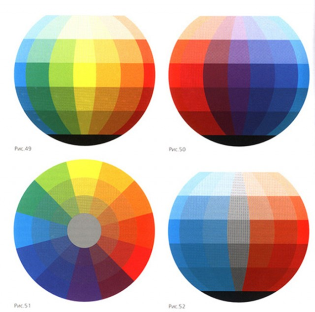
Itten has a ball:
- Hue
- Value
- Chroma.
And now it's time to unite the chromatic and achromatic colors and its qualities in a system.
Itten has a ball:
We see a spectral colors on the equator line. The poles are the white and black. The axis is a grey gradient from the white pole to the black pole. When we move the color from equator line to the axis (to the center) - we change a saturation. When we move a hue from one pole to another - we change value.
Do you remember the three dimensional Munsell's color system? It has the same principle:
And agait I return in the blog "The back 40k_" and to article A little color theory part II (English) by SandWyrm. In the first part we see the same conversation about the color parameters, but the second part is very interesting for the practical advices foк painting miniatures.
Here are some of the author's conclusions that (as I think) is very important and useful for us:
- To get a more realistic or neutral color you need to add both White AND Black.
- Make Sure That You Shade Within The Same Hue
As example here's some Space Marine Minis from the GW catalog. They painted by Ice Blue to highlight the Ultramarine Blue on their power armor. But Ice Blue is a light Cyan, not a Blue. So they look oddly electrical instead of natural because of the difference in Hue.
- Make Sure That You Use A Full Range Of Values. There are many minis that's quite well painted technique-wise, but is very dark overall, making it look muddy and indistinct.And the reason of such kind of works is A) a black undercoat and B) using washes. All of it desaturate colors and do it darker.
Here's a comparison pic showing what author's minis would look like if it was painted this way instead of with a more full value range:
So yes, if you like bright and clear colors on your miniatures - read all article attentively and follow these advices.
Previous:
Let's talk about color theory. Part 1: Goal setting.
Let's talk about color theory. Part 2: Color wheel.
Next:
Let's talk about color theory. Part 4: Сolor harmony


No comments:
Post a Comment