Sunday, June 16, 2013

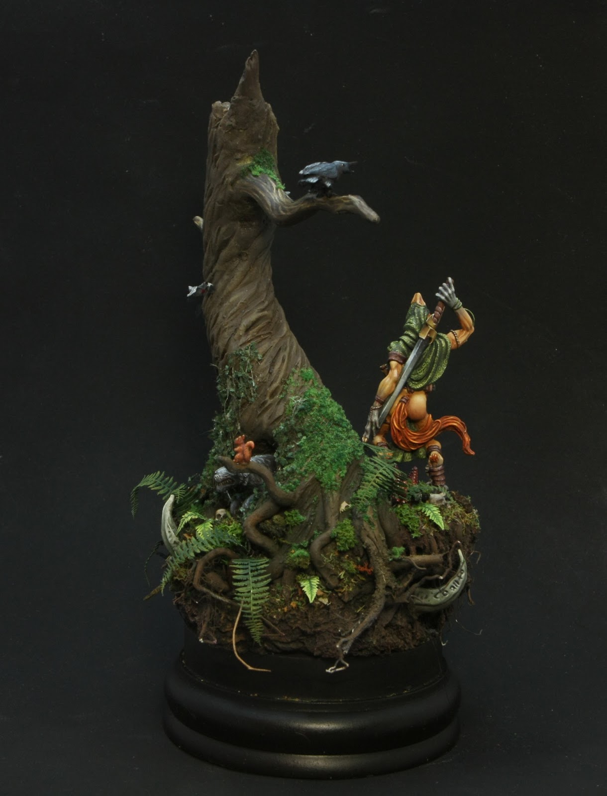
The Wolf's Den. Part 2: Inhabitants.


Ashan-Tyr

  In my imagination Ashan-Tyr has some oriental image, so my goal was to overcome this inner conviction and insert her into the forest atmosphere. Also, I really wanted to make her a "peach" skin. The first result was based on the GW Bleached bone, and it hadn't a success, becausу the skin got a greenish dead tone. After a alcohol bath for me Ashan-Tyr  I tried a scheme based on the VMC Ochre brown + VMC Pale sand. And I was quite satisfied with the result.
  Then I began to select a clothing. If I was not tied to the woods, be sure I painted the clothes in blue color. But in this context it would look alien, thereforeI chose green.
  Here are my attempts to make transparent clothes. I've got some kind of nonsense.
 
After some agony I decided not to go this hard way, and painted it as usual.
And Ashan-Tyr takes her place in the forest.


Ashan-Tyr in the forest.

Varghar

This "man" did not escape the alchocol bath too. My first choice of color scheme was unsuccessful, cold and lifeless for the forest atmosphere. Here's the step after which he went "swimming":

Armed with warm colors I started all over again. And so my new Varhar was born. To my mind it is my best miniature for today. 


The final work will be in the next separate post.

Wednesday, June 12, 2013

Let's talk about color theory. Part 3: Сolor attributes

At the next step I want to look at the whole color system including achromatic part. Let's start with  color qualities.

Сolor attributes

There are a lot of differett color systems, you can read about it  here (Russian). But I think that The HSV Color Model is more popular in painting.
According to it, there are  three main qualities of color: hue, value and saturation.

Hue this quality allows us to classify any chromatic color to a spectrum color. Hue is a quality that called by such words as yellow, red, blue, orange, green, blue-green, purple, etc.

Saturationcharacterizes a degree of the hue purity. If the color tends to monochromatic color, it has more saturation. Achromatic colors have a zero saturation. The spectral colors have a maximum saturationUnsaturated colors are characterized as dull (dull), weak (weak) or washed.
 
Value characterizes the degree of color weakening by white. This option is inherent in the same way to chromatic and achromatic colors. Achromatic colors differ only by brightness, forming a continuous series from "absolutely" black to blinding white.

At the moment let's take a look at Munsell's color system - we see almost the same color attributes​​:
- Hue
- Value
- Chroma.

And now it's time to unite the chromatic and achromatic colors and its
qualities in a system. 
Itten has a ball:
  We see a spectral colors on the equator line.  The poles are the white and black. The axis is a grey  gradient from the white pole to the black pole. When we move the color from equator line to the axis (to the center) - we change a saturation. When we move a hue from one pole to another - we change value.
Do you remember the three dimensional Munsell's color system? It has the same principle:


And agait I return in the blog "The back 40k_" and to article A little color theory part II (English) by SandWyrm. In the first part we see the same conversation about the color parameters, but the second part is very interesting for the practical advices foк painting miniatures.
Here are some of the author's conclusions that (as I think) is very important and useful for us:

- To get a more realistic or neutral color you need to add both White AND Black.
- Make Sure That You Shade Within The Same Hue
As example here's some Space Marine Minis from the GW catalog. They painted by Ice Blue to highlight the Ultramarine Blue on their power armor. But Ice Blue is a light Cyan, not a Blue. So they look oddly electrical instead of natural because of the difference in Hue.

- Make Sure That You Use A Full Range Of Values. There are many minis that's quite well painted technique-wise, but is very dark overall, making it look muddy and indistinct.
And the reason of such kind of works is A) a black undercoat and B) using washes. All of it desaturate colors and do it darker.
Here's a comparison pic showing what author's minis would look like if it was painted this way instead of with a more full value range:

So yes, if you like bright and clear colors on your miniatures - read all article attentively and follow these advices.

Previous:
Let's talk about color theory. Part 1: Goal setting. 
Let's talk about color theory. Part 2: Color wheel. 
Next:
Let's talk about color theory. Part 4: Сolor harmony

Friday, June 7, 2013

Let's talk about color theory. Part 2: Color wheel.

Color wheel.

All colors are divided into two groups: colored and not colored. It's right to say - chromatic and achromatic.
   chromatic - it's red, blue, yellow, pink, green, turquoise, etc.
  achromatic - this group includes white, black and shades of gray (gradual movement from white to black - light gray, gray, dark gray)
Now we'll leave aside achromatic group, and will back to it later.
 
All chromatic colors are represented  in the color wheel.(Russian)

In the 17th century (1665)
Isaac Newton laid a white sunlight into a continuous spectrum using a glass prism and received so-called "spectral color".  Then he made ​​a circle from these colors associating mystical "7 colors" and "7 planets." 

Newton's color wheel
Additionally, there are variations in the color wheel by Goethe, Ostwald, Itten.
 

The most popular element in the color design is a 12-color wheel by Johannes Itten.

It consists of: 
- three primary colors: red, blue, yellow
 - three secondary colors violet, green, orange, obtained by mixing the primary colors
 - six tertiary colors obtained by mixing the adjacent secondary colors. 

There is a very important concept - complementary colors - the colors located opposite each other on the color wheel. Complementary colors neutralize each other when mixing and give a neutral gray.In accordance with the Itten's wheel there are complementary pairs:
red - green
purple - yellow
blue - orange

It's all clear with the Itten's color wheel, but there is a very interesting nuance. If we look at the color spectrum, we can see that the color space from red to yellow less than from green to purple:

So we can conclude that the Itten's color wheel is not accurate. Let's see a three dimensional Munsell's color system.

Munsell's color wheel is built on five primary colors (blue, green, yellow, red, purple) and five intermediate. And the orange color is not independent but intermediate between the yellow and red.So we have a few other complementary pairs, except the one: blue - orange, it is the same everywhere. And now we see:
red - cyan (blue-green)
green - magenta (red-purple)
purple - yellow-green
yellow - blue-violet

In the article "Complementary colors - that you did not know about it" (Russian) you can see the images with these pairs that look simply amazing!

Nadezhda Azarova gives a little lesson on the practical construction of the
Itten's color wheel (Russian).


There is a very interesting
article A Little Color Theory - Part I by SandWyrm (English) based on the Munsell color system. I really like some practical application about the using colors, here are some of them:
  - Don't Cheap Out And Only Buy Just The "Primary Colors". You can't mix every color you need.
  - When Buying Your Paint, Explore Other Options. Citadel makes a good range of hues, but largely ignore Cyan and Magenta.
 
-
The neutral tones can all be mixed using the pure hues, plus black and white.     

  - Make Sure Your Painting Table Is Neutrally Lit
Also the author write about a good minimum citadel paint set so mixing colors you can have almost any color. So read and enjoy!

So, we looked at the color wheel. Basically I'll rely on the Itten's color wheel because all the terminology and quite interesting and harmonious geometric combinations are built on it.

Previous:  Let's talk about color theory. Part 1: Goal setting. 
Next:  

Monday, June 3, 2013

Let's talk about color theory. Part 1: Goal setting.

   At the last time I've been looking for a variety of information on painting miniatures.  So I've  decided to collect and structure a variety interesting conclusions, links to guides and tutorials, which I liked. Most of the information is in Russian, so I apologize for my translation mistakes. And all that is written below is my point of view and reading comprehension.

   As the first article, I've decided to choose the theme of color. It is so global and has a clear space for me. I don't plan to go into highly artistic jungle, I don't get it, but I want to collect basics and the materials that I was interested on this topic.

  
For those who want to explore this issue further and deeper, I can recommend to search for material in the
Painter Library (Russian). There are a plurality of books in electronic form, artists' biographies and pictures.
 

Goal Setting.

Here's the Johannes Itten's words:
    "If the main means of expression is the color, the composition must begin with a definition of color spots, which will determine its pattern. Whoever starts with a drawing, and then adds color to the lines, there will not be a convincing and strong color impact."

   I found a statement of one colorist Nadezhda Azarova that I liked so much:
    "Every work of art  is an idea embodied in a material form. Artist embodies the idea in the picture. Sculptor - in the statue. Architect - in the building. Picture, statue, building - these are the material form. One of the components of the material form is a color palette, that is, the color and the links between them that create the visual color. And the color should be tied to the idea of ​​the work. This will be "shaped relationship."
    
I'll give an example to make it easier to understand these abstract things.
    Let's say you is an artist. And you write the picture on the biblical story - "Descent from the Cross." Previously, every self-respecting artist felt obliged to reflect this theme in his work. Moreover, this kind of works were not written on the finished blueprints, but
accordingly of the author's perception the Gospels text. Accordingly, each author wrote as it saw fit.
    Imagine there is a text (reflecting certain ideas and attitudes), and that's all, nothing more. You want
to capture ideas from the text  in the picture for posterity. So that they inderstand your feelings and impressions.
    So, let's imagine that picture visually. You heroes are: Christ, which is removed from the cross, John, the disciple of Christ, the Virgin and Joseph. The plot is clear, I think. Christ was crucified, and now his loyal people take the body down from the cross. Question, what kind of emotions they are feeling?
    Rejoice? Sorrow? Cry? Anticipating the booze? Experiencing the non-human despair? Maybe they do not care - so passed by, they saw the man on the cross and decided to take him off... Or it is, on the contrary, the biggest event in their life?
    As an artist, you have to feel the emotions of his characters, the selected scene, and then decide - how it is best reflected in a material form. That is, in the picture. What colors to choose? What type of contrast? How to arrange the pieces? Your task is not just to draw a Christmas tree with a house. Your task is to convey the idea, so to touch the soul of your audience so that they feel what you want to express. Does thus value of the picture colorit? Absolutely!
    Similarly, in any kind of design. Contrast is selected for the idea. His task is to emphasize the meaning inherent in the product and make it more vivid, expressive and clear. "

  I think this is fully tolerated in our miniature world, in our material form. We have a miniature  and try to give it the "life", display her mood, status, environment and other. I see this process in creation a scene with its own atmosphere and color solution, in the definition of "focal points". And after it we  select the "tools" - color schemes, contrasts, etc.

And here I want to share with an interesting topic that was raised be the russian artist Dmitry Fesechko (Lynx) on Russian Alternative forum - about Overflow artistic imagery (Russian). He refers  to the Matt Rhodes' post, a famous illustrator. It is a discussion about how to create something unique, but not just another faceless copy. There are many interesting views and suggestions from a various artists in the forum threadAlso, there are interesting comments in the Matt Rhodes' blog (English)

  Изображение


Wow, so many words in the first part. I hope that it will be easier in the future. And next time I want to write about the tools that are at our disposal. 

Next:  Let's talk about color theory. Part 2: Color wheel.

Sunday, May 26, 2013

Chaos Chariot

Practically the whole of April and May turned quite in сhaos for me. That's another unit in this army - Chaos Chariot.
 

Tzeentch Sorcerer - Vilitch the Curseling

Despite the fact that the Spring Angel takes a lot of time for preparation I've  painted several comission works. One of them is  Tzeentch Sorcerer. Unfortunately, I do not know the sculptor of this piece. Honestly, I gradually understood  what is happening there while painting. I think everyone will have their own thoughts about this :).


Tuesday, May 14, 2013

Khorne Chaos Lord on Juggernaut

This Lord was painted for the guys on Juggernauts. Just for table, nothing special. But I had two tasks:  to make him similiar but exuding for this group. It's a pitty that I haven't group pic (.