Color harmony.
Russian versionWhat is a color harmony? Itten writes about it:
When people say about the color harmony, they evaluate the impressions of interaction of two or more colors.
All teaching of color harmony is built on two basic physiological and very interesting facts of the human eye: successive and simultaneous contrasts.
Successive color contrast - this type of contrast arises when we move the look from one hue to another neutral. In this case, at the last object we observe a hue additional to what we have seen before.
This effect is stronger if the first color tone is more saturated.
Try to work out: look at a bright color box about ten seconds and then bring the look at the gray, watching what color it will be painted:


Very interesting "exercises" I found at the article Оptical color illusion in sequential color contrast. I liked the flash movie, where a color picture replaced black-and-white, and if a few seconds to look at the color, the black-and-white will be painted in complementary colors.
And here's another little exercise: what is the color of this phantom point?
 ™
™
And now we can see the pairs of complementary colors by our own eyes. We have that in mind next!
Simultaneous contrast - when we look at the color our eye requires the appearance of its complementary color, and if there is none then simultaneous, that is - at the same time, generates it.
That's an example - there ara gray boxes in different color squares. See what colors they get in each case depending on the color of "background".

We will talk about simultaneous contrast later in the other part.
! The colors that occur in sequential and simultaneous contrasts do not exist! You can not take a picture of it. It is an illusion generated by the ability of our eyes.Thus, the experimental result indicates that the eye receives satisfaction and sense of balance only by the law of complementary colors. Two or more colors are harmonious, if the mixture is a neutral gray color.It seems like everything is clear, but:
And now it's time to get acquainted with the methods of constructing color schemes.

And I've tried to find examples of these schemes. I'll not be surprised if someone finds incorrect me examples, but "I see so" ).
Successive color contrast - this type of contrast arises when we move the look from one hue to another neutral. In this case, at the last object we observe a hue additional to what we have seen before.
This effect is stronger if the first color tone is more saturated.
Try to work out: look at a bright color box about ten seconds and then bring the look at the gray, watching what color it will be painted:

Very interesting "exercises" I found at the article Оptical color illusion in sequential color contrast. I liked the flash movie, where a color picture replaced black-and-white, and if a few seconds to look at the color, the black-and-white will be painted in complementary colors.
And here's another little exercise: what is the color of this phantom point?
And now we can see the pairs of complementary colors by our own eyes. We have that in mind next!
Simultaneous contrast - when we look at the color our eye requires the appearance of its complementary color, and if there is none then simultaneous, that is - at the same time, generates it.
That's an example - there ara gray boxes in different color squares. See what colors they get in each case depending on the color of "background".
We will talk about simultaneous contrast later in the other part.
! The colors that occur in sequential and simultaneous contrasts do not exist! You can not take a picture of it. It is an illusion generated by the ability of our eyes.Thus, the experimental result indicates that the eye receives satisfaction and sense of balance only by the law of complementary colors. Two or more colors are harmonious, if the mixture is a neutral gray color.It seems like everything is clear, but:
In painting, there are many works with a one-sided expressive intonation, and its color composition from this point of view is not harmonious. These works are irritating and too exciting for the using of a single dominant color.
No need to say that the color composition should always be harmonious, and when Sera says that art - it is harmony, it confuses the artistic means and purpose of art.
J. Itten
And now it's time to get acquainted with the methods of constructing color schemes.
Color schemes
With one color
With two colors
 |
| Complementary colors |
 |
| At maximum destination |
 |
| Analogous colors |
With three colors
 |
| Classical triad |
 |
| |Contrast triad |
 |
| Analogous triad |
With four colors
 |
| with complementary colors |
 |
| with analogous colors |
And I've tried to find examples of these schemes. I'll not be surprised if someone finds incorrect me examples, but "I see so" ).
One-color scheme:
The combination of different shades of a single color - monochromatic harmony within a single ray of the circle.
 |
| Eldar Dire avenger by Artur |

 |
| Space Marines Terminator Captain by Artur |
Two-colors schemes:
- based on complimentary colors:

 |
| Cadwallon clerk by Lynx |

 |
| Damrahl, Drune Wyrd by River |
 |
| Sgt Connor Serpentian HI by Morsi |

 |
| Dark emissary by River |
 |
| High Elf Prince on Griffon by River |
- based on colors with maximum destination each from other:

 |
| Nicodemus from Mordheim by rolljordan |

 |
| Dragyri Frostbite by Alexi Z |

 |
| The Goron by River |
- based on two analogous colors (adjacent or over one sector on thу color wheel)

 |
| Pure Psychic Energy... (Vidente Eldar) by Beren5556 |

 |
| Ithandir by bragon |

 |
| Demonette by River |
Three-colors schemes:
- the classic triad based on an equilateral triangle inscribed in a color circle
 |
| Eldar Phoenix Lord Asurmen, The Hand of Asur by River |

 |
| Prince Yriel by razza |
 |
| Eldar Harlequin by River |

 |
| Steampunk Jen Haley by Haley |
-
contrast triad based on an isosceles triangle whose base is formed by two adjacent colors to that lies in front of the top.
  |
| Thousand Sons Dreadnought by Bohun |
 |
| Farseer by Orki |
- analog triad - a combination of three colors-analogues

 |
| Magneto by J.J.Flashman |

 |
| Ayako by SuoU |
Four-colors schemes:
 |
| Severus: 'Renewal' by automaton |

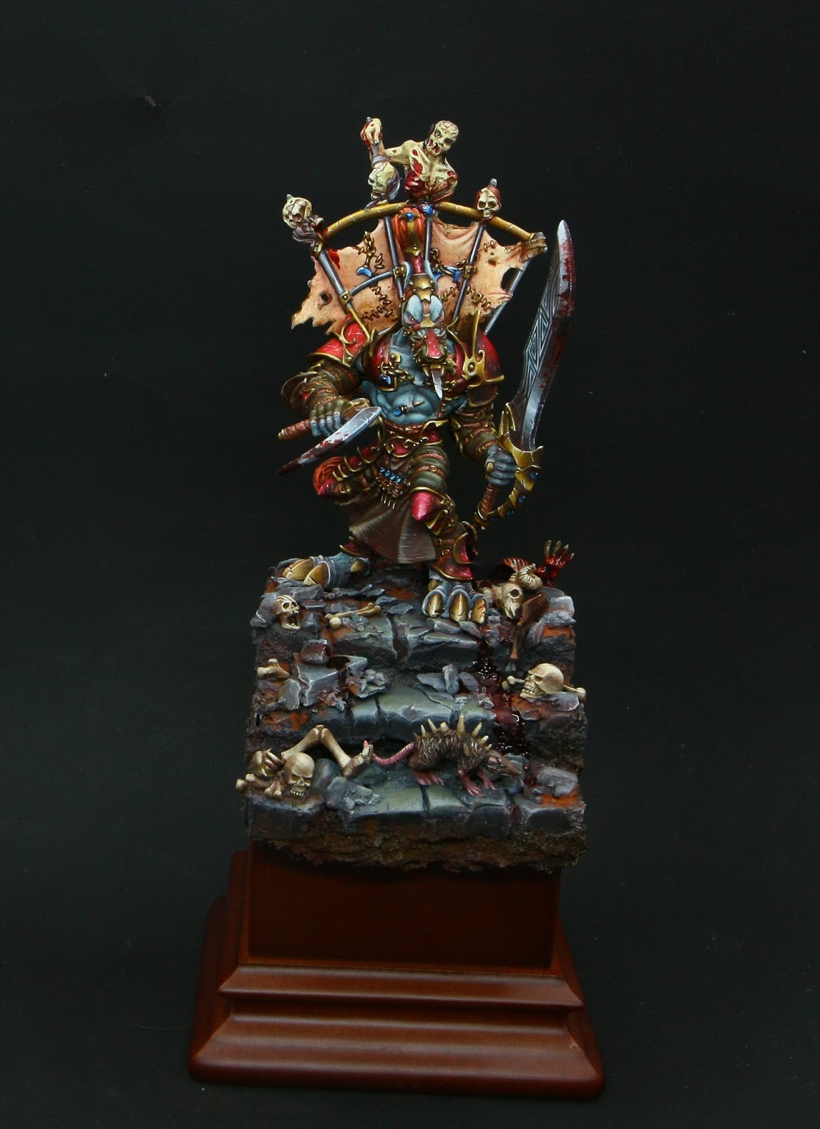
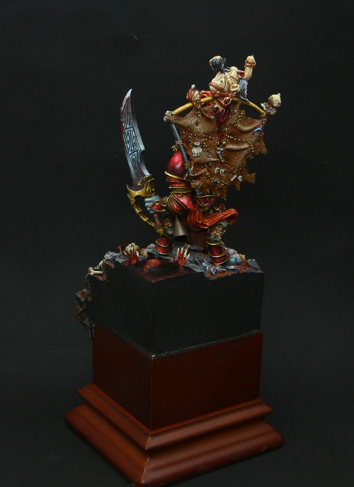
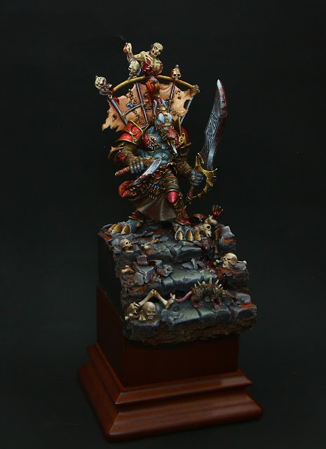 |
| Nekhar the Ecstatic by River |

- tetrad, based on analog colors
Unfortunately, I haven't caught the example, may be I'll find it in the future.
All figures can be inscribed in the color ball. In this case, the color scheme can be used darkened and lightened colors, saturated and desaturated colors, as well as the poles - black and white. Rotate them, we obtain an infinite number of color combinations.

Books about coloristic
And one more library on "Color" theme
Articles about color schemes
- Itten's color wheel. Сolor combinations (Russian)
- Classical color combinations (Russian)
- and again blog "The back 40k_" A little color theory part III (English)
In conclusion, I can say that we must know the finished color scheme and the laws of their construction, but always follow to them - this is the question. Here is a prime example of the "misses" in any scheme of one of my latest work:
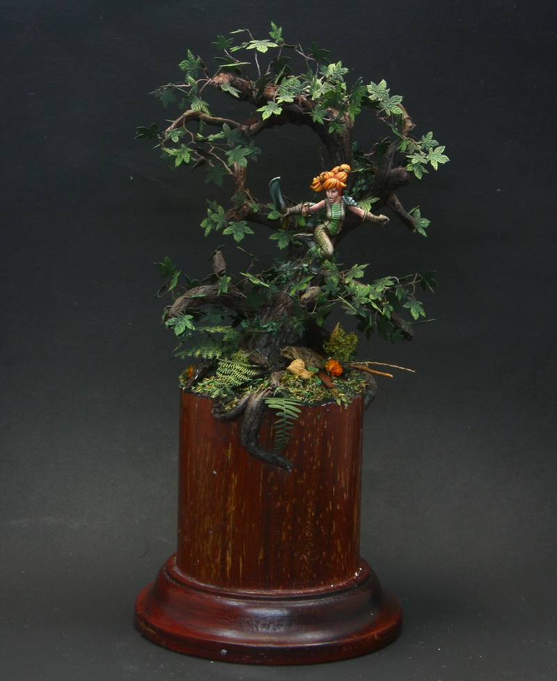
Orange-and-green combination, which I love very much. In accordance to harmony I had to balance the scheme by purple, creating a classic triangle. But Violet did not bred in my imagination to create a natural forest, natural atmosphere. And I found a lot of works with "wrong" schemes, which were really beautifull and emotional. I think this is especially personal color preferences.
There are two more parts about coloristic in my plan (temperature of colors and contrasts), so stay turned...
There are two more parts about coloristic in my plan (temperature of colors and contrasts), so stay turned...